Emblematically Speaking - Stone Dominoes
Tue 18th December 2018 | Stone Dominoes | By Stewart Taylor
There cannot be too many, if any, football clubs known by the name “Dominoes”. If you know any others be sure to let us know.
Other examples of “unusual” names for football clubs include Plymouth Argyle – thought to be from the name of the pub where the founding members might have met and Sheffield Wednesday – the founding members had Wednesday off work.
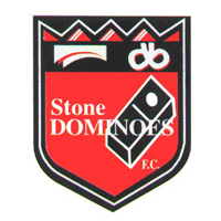
As many may know, the name Dominoes was chosen by the originators of the club who were the St Dominic’s Catholic Church Scout group in Stone, and entirely appropriate, and memorable, it is too.
This gives us the major device on the club emblem of a domino. Specifically, the one/blank domino, perhaps chosen to reflect a 1-0 scoreline in favour of the Dominoes, although it does rather read as an away win.
The name of the organisation is clear to see, and the black and red colourways are a reflection of the playing colours.
The shield itself is of a classical design and features a black band (chief) towards the top. This feature contains two devices which might, at first glance, seem to be a bit difficult to interpret.
However, the one to the right as we view the emblem is a representation of the Stafford Knot. We went into some detail about the origins and meanings of the Stafford Knot in the article about the emblem of Hanley Town published last season so we won’t repeat that.
Simply to say that the Stafford Knot appears in many, many places as a symbol of the county of Staffordshire.
The other device on the chief – to the left as we look – is something of a mystery to me. Indeed, it is something of a mystery to the current officers of Stone Dominoes FC and, as always, any information anyone can come up with to shed light on the meaning of this device would be most helpful.
The best I can imagine is that it is an inverted representation of a book. Given the origins of the football club we might be tempted to suggest that it could be a bible but, really, this is just clutching at straws as why would a book be represented as inverted?
This leaves us with the zig-zag line across the very top of the shield. What we might describe as a zig-zag is defined more precisely in the orientation we see here as dancetty.
Although, having said that, we might expect to see consistent right angles in the depiction and this is not the case at the extremities here. Some sources ascribe the use of this device in heraldry to water.
If we were to take this further we might be tempted to conclude that this referred to the Trent and Mersey Canal which was hugely significant in the industrial heritage of the area.
Sounds feasible? Well, it might be but, as indicated, pure speculation on my part and, as we have seen previously, waterways are more usually represented by wavy lines.
Our conclusion this week has to be that, despite our best efforts, the original intentions of the designers of this emblem remain out of reach and we can only repeat the appeal indicated above for further information, which may well help us to unravel this one.
NOTE - the next story in this series will be published in January.
Emblematically Speaking - Stone Dominoes
Tue 18th December 2018 | Stone Dominoes
By Stewart Taylor
There cannot be too many, if any, football clubs known by the name “Dominoes”. If you know any others be sure to let us know.
Other examples of “unusual” names for football clubs include Plymouth Argyle – thought to be from the name of the pub where the founding members might have met and Sheffield Wednesday – the founding members had Wednesday off work.
As many may know, the name Dominoes was chosen by the originators of the club who were the St Dominic’s Catholic Church Scout group in Stone, and entirely appropriate, and memorable, it is too.
This gives us the major device on the club emblem of a domino. Specifically, the one/blank domino, perhaps chosen to reflect a 1-0 scoreline in favour of the Dominoes, although it does rather read as an away win.
The name of the organisation is clear to see, and the black and red colourways are a reflection of the playing colours.
The shield itself is of a classical design and features a black band (chief) towards the top. This feature contains two devices which might, at first glance, seem to be a bit difficult to interpret.
However, the one to the right as we view the emblem is a representation of the Stafford Knot. We went into some detail about the origins and meanings of the Stafford Knot in the article about the emblem of Hanley Town published last season so we won’t repeat that.
Simply to say that the Stafford Knot appears in many, many places as a symbol of the county of Staffordshire.
The other device on the chief – to the left as we look – is something of a mystery to me. Indeed, it is something of a mystery to the current officers of Stone Dominoes FC and, as always, any information anyone can come up with to shed light on the meaning of this device would be most helpful.
The best I can imagine is that it is an inverted representation of a book. Given the origins of the football club we might be tempted to suggest that it could be a bible but, really, this is just clutching at straws as why would a book be represented as inverted?
This leaves us with the zig-zag line across the very top of the shield. What we might describe as a zig-zag is defined more precisely in the orientation we see here as dancetty.
Although, having said that, we might expect to see consistent right angles in the depiction and this is not the case at the extremities here. Some sources ascribe the use of this device in heraldry to water.
If we were to take this further we might be tempted to conclude that this referred to the Trent and Mersey Canal which was hugely significant in the industrial heritage of the area.
Sounds feasible? Well, it might be but, as indicated, pure speculation on my part and, as we have seen previously, waterways are more usually represented by wavy lines.
Our conclusion this week has to be that, despite our best efforts, the original intentions of the designers of this emblem remain out of reach and we can only repeat the appeal indicated above for further information, which may well help us to unravel this one.
NOTE - the next story in this series will be published in January.