Emblematically Speaking - Alsager Town
Tue 3rd April 2018 | Alsager Town | By Stewart Taylor
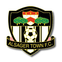
Perhaps the first point to note about the Alsager Town FC emblem is that we see a shield within a shield, an inescutcheon as we discovered a few weeks ago, and that the shapes of these shields are different.
Throughout this series of articles, we have regularly come across shields of a classic design with a flat top. Neither of the shields depicted here mirror that observation.
If we look at the main shield first we see a domed top and that is potentially revealing in that this design is not routinely seen in classical heraldry.
It could, therefore, be considered that the use of a domed shield is a “convenience” and gives us a clue as to how the emblem was arrived at.
The shape of the shield within the chief of the larger shield is a bit more classical in heraldic terms being generally described as “wide topped”.
If we examine the idea of convenience we could suggest that the way that the larger shield is domed at the top gives space to better show off the smaller shield in the chief.
Indeed, if the top of the main shield was flat, then the balance of the devices in the chief would be less aesthetically pleasing.
The choice of the devices within the chief of the overall emblem helps us to locate the club with reasonable precision.
As the town of Alsager is in Cheshire we may be tempted to think that the trees are “cheshire oaks” and if that gives immediate thoughts of the “designer outlet” of that name close to Ellesmere Port then we would be mistaken – no retail therapy here!
The trees in question, which may well be oaks, are a reference to Wood Park which lies to the side of the Alsager Town ground and contains the Wilbraham’s Wood Playground. Look to the left as you walk down to the ground from the car park and all is revealed.
The shield contained within the chief is a reference to the Alsager Town Council Coat of Arms but has been somewhat modified. The three gold coloured shapes in the football club emblem are lions in the attitude known as rampant and come directly from the Town Council shield.
The chevron is a very common device in both British and French heraldry and is used to represent the roof of a house – the French word chevron may be readily translated in English as rafter.
The chevron was granted to those who had participated in some significant enterprise such as building a fortress or a church. The example we see here is red in colour although the chevron on the Alsager Town Council emblem is blue – a bit of poetic licence perhaps.
This blue chevron also shows the now familiar three wheatsheaves as a representation of the County of Cheshire – from the Earls of Chester – but these are missing on the football club emblem.
The lower part of the main shield in pretty much self-explanatory with a representation of a football – showing both pentagons and hexagons - and the name of the club on a background which shows the club playing colours.
What we can infer from all of the above is that, not for the first time, we see a football club emblem which has been designed by the club to clearly identify that the emblem represents a football club and to place that club accurately geographically.
Special permission was granted by Alsager Town Council for the club to include elements of the Town Coat of Arms into the football club emblem.
With thanks to Pauline Matthews of Alsager Town FC for help in compiling this article.
Emblematically Speaking - Alsager Town
Tue 3rd April 2018 | Alsager Town
By Stewart Taylor
Perhaps the first point to note about the Alsager Town FC emblem is that we see a shield within a shield, an inescutcheon as we discovered a few weeks ago, and that the shapes of these shields are different.
Throughout this series of articles, we have regularly come across shields of a classic design with a flat top. Neither of the shields depicted here mirror that observation.
If we look at the main shield first we see a domed top and that is potentially revealing in that this design is not routinely seen in classical heraldry.
It could, therefore, be considered that the use of a domed shield is a “convenience” and gives us a clue as to how the emblem was arrived at.
The shape of the shield within the chief of the larger shield is a bit more classical in heraldic terms being generally described as “wide topped”.
If we examine the idea of convenience we could suggest that the way that the larger shield is domed at the top gives space to better show off the smaller shield in the chief.
Indeed, if the top of the main shield was flat, then the balance of the devices in the chief would be less aesthetically pleasing.
The choice of the devices within the chief of the overall emblem helps us to locate the club with reasonable precision.
As the town of Alsager is in Cheshire we may be tempted to think that the trees are “cheshire oaks” and if that gives immediate thoughts of the “designer outlet” of that name close to Ellesmere Port then we would be mistaken – no retail therapy here!
The trees in question, which may well be oaks, are a reference to Wood Park which lies to the side of the Alsager Town ground and contains the Wilbraham’s Wood Playground. Look to the left as you walk down to the ground from the car park and all is revealed.
The shield contained within the chief is a reference to the Alsager Town Council Coat of Arms but has been somewhat modified. The three gold coloured shapes in the football club emblem are lions in the attitude known as rampant and come directly from the Town Council shield.
The chevron is a very common device in both British and French heraldry and is used to represent the roof of a house – the French word chevron may be readily translated in English as rafter.
The chevron was granted to those who had participated in some significant enterprise such as building a fortress or a church. The example we see here is red in colour although the chevron on the Alsager Town Council emblem is blue – a bit of poetic licence perhaps.
This blue chevron also shows the now familiar three wheatsheaves as a representation of the County of Cheshire – from the Earls of Chester – but these are missing on the football club emblem.
The lower part of the main shield in pretty much self-explanatory with a representation of a football – showing both pentagons and hexagons - and the name of the club on a background which shows the club playing colours.
What we can infer from all of the above is that, not for the first time, we see a football club emblem which has been designed by the club to clearly identify that the emblem represents a football club and to place that club accurately geographically.
Special permission was granted by Alsager Town Council for the club to include elements of the Town Coat of Arms into the football club emblem.
With thanks to Pauline Matthews of Alsager Town FC for help in compiling this article.