Emblematically Speaking - City of Liverpool FC
Tue 24th October 2017 | City of Liverpool | By Stewart Taylor
This week we get the rare opportunity to dispel an urban myth.
As we know, urban myths often develop over time and relate to a piece of information which is not true but is universally accepted as true.
The urban myth in question here relates to a football club which a mere two or three years ago was but a twinkle in the eye of a few committed individuals.
Intrigued? Good. All will be revealed later.
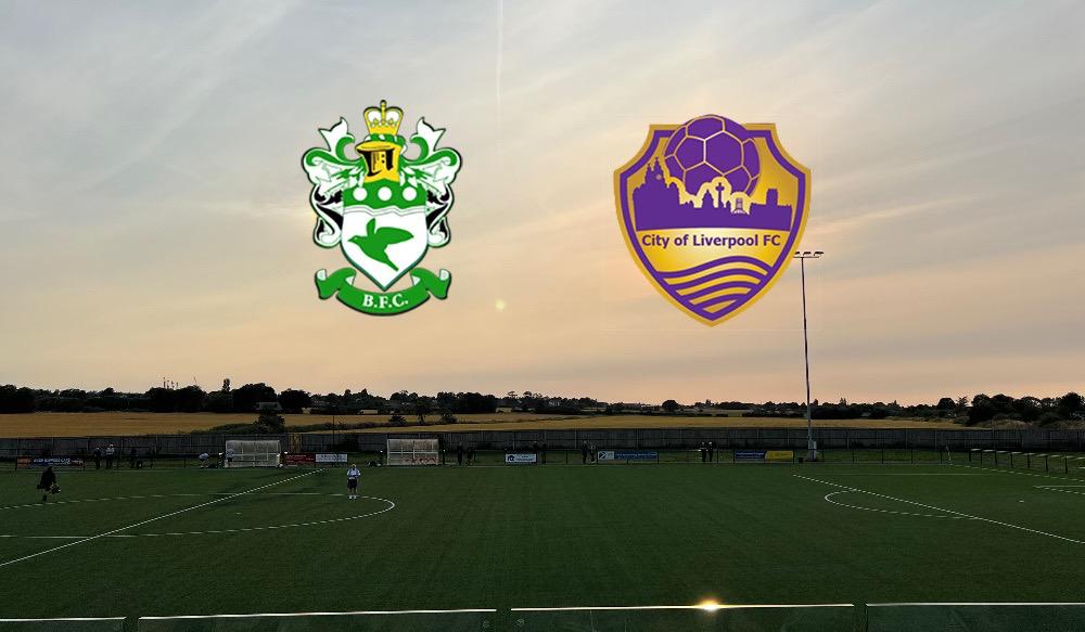
City of Liverpool FC were formed with the objective of introducing a completely new football club for the entire City of Liverpool, Reds, Blues and neutrals.
The club was not, and is not, a protest club born out of frustration and trying to force a big brother club to change its ways somehow. City of Liverpool FC was born out of love and pride in the city’s footballing ability.
Urban myth dispelled right there would you think? Well, no, that’s not it. Keep reading.
Being that the club “had no history, only a future”, references to the past needed to be avoided, so Coats of Arms linked to the City or Latin proverbs were out. This was a brand new club and need was for an emblem that was modern in its design, and that quickly and easily conveyed the message of who they were.
In other words the club wanted a meme.
At this point, for the less “hipster” amongst us (including myself), we’d better define a meme and the best we can do in this context is to say that a meme is an image that is copied and spread rapidly by Internet users.
If you detect a bit of a marketing angle to this then you would be correct and, as we have seen over many years, marketing is a key tool in the development of anything. We could then ask the question who are the best marketeers in the world? And, for many, the answer would be the Americans.
Recognising this, the club sought inspiration from the “Land of the Free” and took on board the approach of Major League Soccer (MLS) which is renowned as a home of excellent marketing.
Bearing in mind that back in 2014/15 the two big local football clubs were doing the same, simplifying their badges for marketing purposes, with Liverpool FC returning to the Liver Bird alone and Everton FC to the Tower. All embellishments were being removed from club emblems the world over, and that fed into the design process.
If the club couldn’t have the Liver Bird or the Tower, the obvious choice was to use the iconic Liverpool Skyline and so that’s where it started. After some discussions it was decided that the Three Graces, Two Cathedrals and the Radio City Tower should be included and a graphic artist was commissioned to draw this up.
At this point, we have to recall that City of Liverpool FC is a fan owned club with a significant number of members and this structure leads to long and complex discussions, some may say tortuous pathways, to reach conclusions but this is democracy, the members have their opinions and, quite rightly, will express them.
Previous articles in this series have referred to the River Mersey and, as the river is both the physical and emotional power source of the City, it had to be included.
Quite how to represent the river caused a number of discussions but, in the end, the “wavy lines” were selected. The final graphical element of the emblem was added in the shape of a football and that was it, or was it?
At this point the process was stopped and market research carried out . By this time there were 9 versions of the badge as it had evolved step by step and the club wanted to ensure that in all the debates the core strategy of the emblem, to give the simplest visual description of the club or who the club were trying to be, had not been missed.
Various formats of the logo were sent out via social media and email to contacts all over the City, the Country, Europe and the World and asked the question “What does this logo say to you?”
The answers informed the decision that it was necessary to add in the name of the club; City of Liverpool FC.
That was done and the emblem was sent back out to the focus groups. The responses came back virtually entirely positively and the emblem was then officially created in its final design.
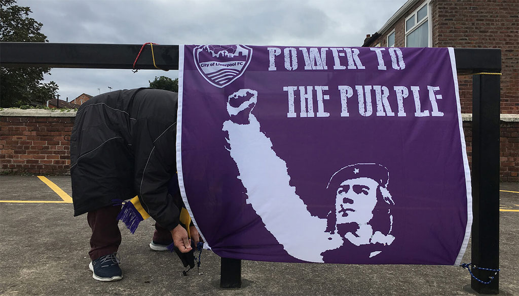
And now the urban myth. The only thing to add was the club colours and, contrary to popular belief, the colour Purple was not chosen because it was a mixture of Red and Blue as the club wanted no reference whatsoever Liverpool FC or Everton FC. It is simply the civic colour of the City of Liverpool, to which the complementary colour Gold was added.
And there we have, at least part, of the story of “The Purps”.
Thanks to Paul Manning, Chairman of City of Liverpool FC, for his help in compiling this article.
Emblematically Speaking - City of Liverpool FC
Tue 24th October 2017 | City of Liverpool
By Stewart Taylor
This week we get the rare opportunity to dispel an urban myth.
As we know, urban myths often develop over time and relate to a piece of information which is not true but is universally accepted as true.
The urban myth in question here relates to a football club which a mere two or three years ago was but a twinkle in the eye of a few committed individuals.
Intrigued? Good. All will be revealed later.
City of Liverpool FC were formed with the objective of introducing a completely new football club for the entire City of Liverpool, Reds, Blues and neutrals.
The club was not, and is not, a protest club born out of frustration and trying to force a big brother club to change its ways somehow. City of Liverpool FC was born out of love and pride in the city’s footballing ability.
Urban myth dispelled right there would you think? Well, no, that’s not it. Keep reading.
Being that the club “had no history, only a future”, references to the past needed to be avoided, so Coats of Arms linked to the City or Latin proverbs were out. This was a brand new club and need was for an emblem that was modern in its design, and that quickly and easily conveyed the message of who they were.
In other words the club wanted a meme.
At this point, for the less “hipster” amongst us (including myself), we’d better define a meme and the best we can do in this context is to say that a meme is an image that is copied and spread rapidly by Internet users.
If you detect a bit of a marketing angle to this then you would be correct and, as we have seen over many years, marketing is a key tool in the development of anything. We could then ask the question who are the best marketeers in the world? And, for many, the answer would be the Americans.
Recognising this, the club sought inspiration from the “Land of the Free” and took on board the approach of Major League Soccer (MLS) which is renowned as a home of excellent marketing.
Bearing in mind that back in 2014/15 the two big local football clubs were doing the same, simplifying their badges for marketing purposes, with Liverpool FC returning to the Liver Bird alone and Everton FC to the Tower. All embellishments were being removed from club emblems the world over, and that fed into the design process.
If the club couldn’t have the Liver Bird or the Tower, the obvious choice was to use the iconic Liverpool Skyline and so that’s where it started. After some discussions it was decided that the Three Graces, Two Cathedrals and the Radio City Tower should be included and a graphic artist was commissioned to draw this up.
At this point, we have to recall that City of Liverpool FC is a fan owned club with a significant number of members and this structure leads to long and complex discussions, some may say tortuous pathways, to reach conclusions but this is democracy, the members have their opinions and, quite rightly, will express them.
Previous articles in this series have referred to the River Mersey and, as the river is both the physical and emotional power source of the City, it had to be included.
Quite how to represent the river caused a number of discussions but, in the end, the “wavy lines” were selected. The final graphical element of the emblem was added in the shape of a football and that was it, or was it?
At this point the process was stopped and market research carried out . By this time there were 9 versions of the badge as it had evolved step by step and the club wanted to ensure that in all the debates the core strategy of the emblem, to give the simplest visual description of the club or who the club were trying to be, had not been missed.
Various formats of the logo were sent out via social media and email to contacts all over the City, the Country, Europe and the World and asked the question “What does this logo say to you?”
The answers informed the decision that it was necessary to add in the name of the club; City of Liverpool FC.
That was done and the emblem was sent back out to the focus groups. The responses came back virtually entirely positively and the emblem was then officially created in its final design.
And now the urban myth. The only thing to add was the club colours and, contrary to popular belief, the colour Purple was not chosen because it was a mixture of Red and Blue as the club wanted no reference whatsoever Liverpool FC or Everton FC. It is simply the civic colour of the City of Liverpool, to which the complementary colour Gold was added.
And there we have, at least part, of the story of “The Purps”.
Thanks to Paul Manning, Chairman of City of Liverpool FC, for his help in compiling this article.