Emblematically Speaking - Burscough
Tue 30th January 2018 | Burscough | By Stewart Taylor
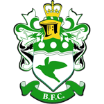
The origins of the Burscough emblem are somewhat lost in the mists of time but this is what is generally known.
Although the current club was formed in 1946, the origins of many of Burscough Football Club’s traditions may be traced back to the Burscough Rangers Football Club that existed between 1905 and 1935. Their original colours were blue and chocolate halves or squares.
In March 1906 a meeting was called to consider a change of colours. Mr J.W. Berry the club secretary suggested that as a Ranger was a person whose job was among fields and forests then the colour should be green. Burscough’s nickname, the Linnets, came into being at this time.
Now, even though a linnet is mainly brown, guides to British Birds refer to the Greenfinch as a Green Linnet. The centre of the badge clearly displays a green bird as a reference to the green linnet.
This is fine and certainly explains both the colours used in the emblem and the prominent use of a green bird in the bottom part of the shield.
But what of the rest of the emblem? Using our newly found knowledge of heraldry we can try to work out what it all means, and see if the speculation makes any sense.
Starting at the top we see a crown. Though their original purpose was most likely to keep long hair out of a man's face, crowns evolved into a symbol of rank and position and were often emblazoned on heralds.
Royal leaders wore them as a sign of power. They also wore them in battle to show that they were due special protection from their own soldiers. Religions men too wore crowns.
Similar to royal ones, the crowns and hats of the religious were signs of rank and standing within their religious order.
The one we see here bears some resemblance to the Imperial Crown as worn by monarchs of England over many centuries but also references religious crowns due to the presence of crosses.
That the crown is depicted in gold colour doesn’t really help us as gold was, and is, used as a symbol of eternity, power and strength – qualities which sit well with the concept of both monarchy and church.
Below the crown sits a closed helm(et). A closed helm generally represents the lower classes in the heraldic pecking order such as lesser nobility or town burghers or, even, as a representation of the bourgeoisie.
If we then turn out attention to the shield we can see a typical design incorporating a chief. A chief is a charge on a coat of arms that takes the form of a band running horizontally across the top edge of the shield.
Writers disagree in how much of the shield's surface is to be covered by the chief, ranging from one-fourth to one-third. The former is more likely if the chief is uncharged, that is, if it does not have other objects placed on it.
If charged, the chief is typically wider to allow room for the objects drawn there. What we see here are the simplest of charges on the chief consisting of three sold circles known as roundels.
The use of roundels dates back to the very beginning of heraldic design and have the alternative name of besants when appearing in metallic colours – in this case white which is used to represent silver (argent). A besant is a representation of a coin and may well be used as an indicator of wealth.
Just below the chief sits our old friend the wavy lines. We have seen in previous articles how wavy lines are used to represent waterways and, in our region that is very often the River Mersey.
As Burscough is quite some way away from the River Mersey we need to look at an alternative watercourse which may explain the presence of the wavy lines on this emblem.
Burscough lies on the route of the Leeds/Liverpool Canal and was a staging post for the Wigan to Liverpool packet boat. Perhaps this is significant in the selection of the particular element of the design.
OK. A few ideas; but does this really work? The contention is that the explanation above doesn’t really hold together. The crown could be either royal or ecclesiastical, the helm represents the lower ranks, the connection with silver money is tenuous and the Leeds/Liverpool Canal is relatively recent.
The alternative suggestion is that the emblem was designed at around the time of the change of colours in 1906 and makes clear references to heraldic design but is somewhat stylised or, even, fanciful.
This may be doing someone a huge disservice and, if so, apologies are due. If you know more about the design of this particular emblem then please get in touch – we would be delighted to put the record straight.
With thanks to Steve Halliwell of Burscough FC for his help in putting together this article.
Emblematically Speaking - Burscough
Tue 30th January 2018 | Burscough
By Stewart Taylor
The origins of the Burscough emblem are somewhat lost in the mists of time but this is what is generally known.
Although the current club was formed in 1946, the origins of many of Burscough Football Club’s traditions may be traced back to the Burscough Rangers Football Club that existed between 1905 and 1935. Their original colours were blue and chocolate halves or squares.
In March 1906 a meeting was called to consider a change of colours. Mr J.W. Berry the club secretary suggested that as a Ranger was a person whose job was among fields and forests then the colour should be green. Burscough’s nickname, the Linnets, came into being at this time.
Now, even though a linnet is mainly brown, guides to British Birds refer to the Greenfinch as a Green Linnet. The centre of the badge clearly displays a green bird as a reference to the green linnet.
This is fine and certainly explains both the colours used in the emblem and the prominent use of a green bird in the bottom part of the shield.
But what of the rest of the emblem? Using our newly found knowledge of heraldry we can try to work out what it all means, and see if the speculation makes any sense.
Starting at the top we see a crown. Though their original purpose was most likely to keep long hair out of a man's face, crowns evolved into a symbol of rank and position and were often emblazoned on heralds.
Royal leaders wore them as a sign of power. They also wore them in battle to show that they were due special protection from their own soldiers. Religions men too wore crowns.
Similar to royal ones, the crowns and hats of the religious were signs of rank and standing within their religious order.
The one we see here bears some resemblance to the Imperial Crown as worn by monarchs of England over many centuries but also references religious crowns due to the presence of crosses.
That the crown is depicted in gold colour doesn’t really help us as gold was, and is, used as a symbol of eternity, power and strength – qualities which sit well with the concept of both monarchy and church.
Below the crown sits a closed helm(et). A closed helm generally represents the lower classes in the heraldic pecking order such as lesser nobility or town burghers or, even, as a representation of the bourgeoisie.
If we then turn out attention to the shield we can see a typical design incorporating a chief. A chief is a charge on a coat of arms that takes the form of a band running horizontally across the top edge of the shield.
Writers disagree in how much of the shield's surface is to be covered by the chief, ranging from one-fourth to one-third. The former is more likely if the chief is uncharged, that is, if it does not have other objects placed on it.
If charged, the chief is typically wider to allow room for the objects drawn there. What we see here are the simplest of charges on the chief consisting of three sold circles known as roundels.
The use of roundels dates back to the very beginning of heraldic design and have the alternative name of besants when appearing in metallic colours – in this case white which is used to represent silver (argent). A besant is a representation of a coin and may well be used as an indicator of wealth.
Just below the chief sits our old friend the wavy lines. We have seen in previous articles how wavy lines are used to represent waterways and, in our region that is very often the River Mersey.
As Burscough is quite some way away from the River Mersey we need to look at an alternative watercourse which may explain the presence of the wavy lines on this emblem.
Burscough lies on the route of the Leeds/Liverpool Canal and was a staging post for the Wigan to Liverpool packet boat. Perhaps this is significant in the selection of the particular element of the design.
OK. A few ideas; but does this really work? The contention is that the explanation above doesn’t really hold together. The crown could be either royal or ecclesiastical, the helm represents the lower ranks, the connection with silver money is tenuous and the Leeds/Liverpool Canal is relatively recent.
The alternative suggestion is that the emblem was designed at around the time of the change of colours in 1906 and makes clear references to heraldic design but is somewhat stylised or, even, fanciful.
This may be doing someone a huge disservice and, if so, apologies are due. If you know more about the design of this particular emblem then please get in touch – we would be delighted to put the record straight.
With thanks to Steve Halliwell of Burscough FC for his help in putting together this article.