
Emblematically Speaking - AFC Liverpool
Tue 9th January 2018 | AFC Liverpool | By Stewart Taylor
Many of the articles in this series have referred to heraldry. Such heraldry has generally been of the medieval type although there are others.
This week we get the opportunity to explore in a little detail Socialist Heraldry and, in doing so, make reference to that part of our recent history when tensions between countries, or specific groups of countries, were particularly high.
The origins of Socialist Heraldry can be found in the symbolism of the Soviet Union which was formed in 1922 and then extended into the Soviet Bloc after the Second World War.
The end of the Soviet Bloc (known also as the Warsaw Pact) came following the events of 1989 generally referred to as The Fall of the Berlin Wall.
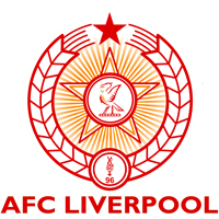
The emblems associated with Socialist Heraldry are many, but the key ones are the five pointed star representing the five fingers of the worker’s hand, wreathes of grain encircling the emblem representing agriculture and plenty, and the colour red.
All of these elements are found in the emblem of AFC Liverpool and there is no coincidence in that.
AFC Liverpool Chairman Chris Stirrup takes up the story.
“When we formed the Club in 2008, obviously we had no badge. Everyone had an idea of what they wanted so we decided to run a competition.
“So via the website we asked for designs. We got hundreds from all over the world sent to us. After a fortnight we had to stop, as we had so many to choose from.
“With so many, the next step was to whittle them down so again, via the website, we published them and conducted a poll.”
”With a top ten chosen, we then had to pick a winner. So as a board we chose our top three designs. Now we were down to three, the job came to choose a winner, so we decided to let kids from a local school pick that winner.”
“Given the socialist leaning of our Club’s set up, it was very apt that the kids chose the badge we have. The design is very similar to the badges of some old Eastern European sides from the Cold War Era, and that to me and everyone involved, we loved the winner.
“It invoked memories of Liverpool FC matches played behind the Iron Curtain, with commentary done down a bad phone line, against teams often described as 'A crack Eastern European outfit', largely due to the fact no one knew anything about them, and in some ways, that was us 10 years ago!
”The badge has had one change in the last ten years though, with the 96 flame replacing a football as an everlasting tribute.”
The inclusion of the Liver Bird in the centre of the club emblem is, of course, a direct reference to both the City of Liverpool and Liverpool FC. There is some history behind the use of what we now know as the Liver Bird as we might expect.
Originally, and here we are going back to the foundation of Liverpool by King John in 1207, the bird was an eagle. The new town adopted King John's seal as its own. The seal showed the eagle of St John holding a sprig of broom in its beak. The broom, or planta genista was the symbol of the royal house of the Plantagenets.
In 1644 the seal was lost and a new seal was made. For some reason the eagle was replaced by a cormorant, a more familiar bird in the area. It is possible that the artist mistook the eagle for a cormorant. The piece of broom was replaced by a piece of seaweed. The cormorant, as depicted, became known as the Liver Bird.
The dominant colour of red, supported by yellow highlights, again refers directly to Socialist Heraldry and Liverpool FC in addition to being the playing colours of the club.
Not for the first time in this series, we see what might at first glance appear to be a relatively simple emblem is, in fact, rich with symbolism. The tragic events of April 15th 1989 are known to all both within the football family and throughout wider society. The fight for justice continues.
With thanks to Chris Stirrup, Chairman of AFC Liverpool, for his contribution to this article.
Emblematically Speaking - AFC Liverpool
Tue 9th January 2018 | AFC Liverpool
By Stewart Taylor
Many of the articles in this series have referred to heraldry. Such heraldry has generally been of the medieval type although there are others.
This week we get the opportunity to explore in a little detail Socialist Heraldry and, in doing so, make reference to that part of our recent history when tensions between countries, or specific groups of countries, were particularly high.
The origins of Socialist Heraldry can be found in the symbolism of the Soviet Union which was formed in 1922 and then extended into the Soviet Bloc after the Second World War.
The end of the Soviet Bloc (known also as the Warsaw Pact) came following the events of 1989 generally referred to as The Fall of the Berlin Wall.
The emblems associated with Socialist Heraldry are many, but the key ones are the five pointed star representing the five fingers of the worker’s hand, wreathes of grain encircling the emblem representing agriculture and plenty, and the colour red.
All of these elements are found in the emblem of AFC Liverpool and there is no coincidence in that.
AFC Liverpool Chairman Chris Stirrup takes up the story.
“When we formed the Club in 2008, obviously we had no badge. Everyone had an idea of what they wanted so we decided to run a competition.
“So via the website we asked for designs. We got hundreds from all over the world sent to us. After a fortnight we had to stop, as we had so many to choose from.
“With so many, the next step was to whittle them down so again, via the website, we published them and conducted a poll.”
”With a top ten chosen, we then had to pick a winner. So as a board we chose our top three designs. Now we were down to three, the job came to choose a winner, so we decided to let kids from a local school pick that winner.”
“Given the socialist leaning of our Club’s set up, it was very apt that the kids chose the badge we have. The design is very similar to the badges of some old Eastern European sides from the Cold War Era, and that to me and everyone involved, we loved the winner.
“It invoked memories of Liverpool FC matches played behind the Iron Curtain, with commentary done down a bad phone line, against teams often described as 'A crack Eastern European outfit', largely due to the fact no one knew anything about them, and in some ways, that was us 10 years ago!
”The badge has had one change in the last ten years though, with the 96 flame replacing a football as an everlasting tribute.”
The inclusion of the Liver Bird in the centre of the club emblem is, of course, a direct reference to both the City of Liverpool and Liverpool FC. There is some history behind the use of what we now know as the Liver Bird as we might expect.
Originally, and here we are going back to the foundation of Liverpool by King John in 1207, the bird was an eagle. The new town adopted King John's seal as its own. The seal showed the eagle of St John holding a sprig of broom in its beak. The broom, or planta genista was the symbol of the royal house of the Plantagenets.
In 1644 the seal was lost and a new seal was made. For some reason the eagle was replaced by a cormorant, a more familiar bird in the area. It is possible that the artist mistook the eagle for a cormorant. The piece of broom was replaced by a piece of seaweed. The cormorant, as depicted, became known as the Liver Bird.
The dominant colour of red, supported by yellow highlights, again refers directly to Socialist Heraldry and Liverpool FC in addition to being the playing colours of the club.
Not for the first time in this series, we see what might at first glance appear to be a relatively simple emblem is, in fact, rich with symbolism. The tragic events of April 15th 1989 are known to all both within the football family and throughout wider society. The fight for justice continues.
With thanks to Chris Stirrup, Chairman of AFC Liverpool, for his contribution to this article.