Emblematically Speaking - Cammell Laird 1907
Tue 19th December 2017 | Cammell Laird 1907 | By Stewart Taylor
The history of football clubs representing companies is always interesting in that some of these clubs evoke strong memories of the industrial heartland and heritage of the country – much of which is now, sadly, lost or, a the very best, confined to history.
It is not the objective of these short articles to go off on one about what once was and how such a situation occurred but it would be impossible to consider the emblem of Cammell Laird 1907 FC without some reference to the shipbuilding industry on Merseyside which, thanks to significant technical advances and some excellent commercial decisions, continues to this day.
The Cammell Laird company can trace its roots back to the Georgian era and, specifically, the late Regency period. The company was a pioneer in its field and produced many ships which have a proud place in the history of the country. The most recent aircraft carrier in the British fleet is HMS Queen Elizabeth which features flight decks made by Cammell Laird.
The football club was established in 1907 as the Cammell Laird Institute FC in a clear reference to the company. This link to the company continued, on and off, for over 100 years until the club disbanded in 2014 to be reformed under the new name.
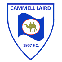
The new club needed a new emblem but as the name of the club continued to make reference to Cammell Laird then it was decided that the club emblem should do the same.
The Chairman of the club at the time of reformation designed the new emblem which, essentially, takes part of the old club badge, adds the name of the new club and contains that within a shield design.
The flag part of the device is the flag of the Cammell Laird company and is a reference its seafaring nature. This is emphasised by the use of a blue colour to represent the River Mersey into which so many ships manufactured by the company were launched.
It is perhaps the camel device in the centre of the flag which creates most discussion and here we can introduce the concept of a homonym. Homonyms are words which sound alike but have different meanings.
The Cammell part of the Cammell Laird company name came from Johnson Cammell and Company of Sheffield who were co founders of the company with Laird, Son and Company of Birkenhead. Camel is a homonym of Cammell so it seems reasonable to adopt such a device even though, last I knew, camels were not native to Merseyside.
If we have a camel then there is a choice between one humped (Dromedary) or two humped (Bactrian).
There is a splendid story which suggests that the adoption of the Bactrian camel comes from the old saying relating to the company “Two M's, two L's, two humps!” as a mnemonic to help people spell the company name correctly.
Whether this is true or not, and it does have a ring of credibility to it, what we see today is a club emblem which is modern in design but directly refers to the origins of the club. As we have seen previously in this series of articles, relatively simple club emblems which instantly identify with what the organisation is today and, with that, a link back into history are powerful marketing tools.
(With thanks to Toddy Wood of Cammell Laird 1907 for his help in compiling this article).
Emblematically Speaking - Cammell Laird 1907
Tue 19th December 2017 | Cammell Laird 1907
By Stewart Taylor
The history of football clubs representing companies is always interesting in that some of these clubs evoke strong memories of the industrial heartland and heritage of the country – much of which is now, sadly, lost or, a the very best, confined to history.
It is not the objective of these short articles to go off on one about what once was and how such a situation occurred but it would be impossible to consider the emblem of Cammell Laird 1907 FC without some reference to the shipbuilding industry on Merseyside which, thanks to significant technical advances and some excellent commercial decisions, continues to this day.
The Cammell Laird company can trace its roots back to the Georgian era and, specifically, the late Regency period. The company was a pioneer in its field and produced many ships which have a proud place in the history of the country. The most recent aircraft carrier in the British fleet is HMS Queen Elizabeth which features flight decks made by Cammell Laird.
The football club was established in 1907 as the Cammell Laird Institute FC in a clear reference to the company. This link to the company continued, on and off, for over 100 years until the club disbanded in 2014 to be reformed under the new name.
The new club needed a new emblem but as the name of the club continued to make reference to Cammell Laird then it was decided that the club emblem should do the same.
The Chairman of the club at the time of reformation designed the new emblem which, essentially, takes part of the old club badge, adds the name of the new club and contains that within a shield design.
The flag part of the device is the flag of the Cammell Laird company and is a reference its seafaring nature. This is emphasised by the use of a blue colour to represent the River Mersey into which so many ships manufactured by the company were launched.
It is perhaps the camel device in the centre of the flag which creates most discussion and here we can introduce the concept of a homonym. Homonyms are words which sound alike but have different meanings.
The Cammell part of the Cammell Laird company name came from Johnson Cammell and Company of Sheffield who were co founders of the company with Laird, Son and Company of Birkenhead. Camel is a homonym of Cammell so it seems reasonable to adopt such a device even though, last I knew, camels were not native to Merseyside.
If we have a camel then there is a choice between one humped (Dromedary) or two humped (Bactrian).
There is a splendid story which suggests that the adoption of the Bactrian camel comes from the old saying relating to the company “Two M's, two L's, two humps!” as a mnemonic to help people spell the company name correctly.
Whether this is true or not, and it does have a ring of credibility to it, what we see today is a club emblem which is modern in design but directly refers to the origins of the club. As we have seen previously in this series of articles, relatively simple club emblems which instantly identify with what the organisation is today and, with that, a link back into history are powerful marketing tools.
(With thanks to Toddy Wood of Cammell Laird 1907 for his help in compiling this article).