Emblematically Speaking - Avro
Tue 11th December 2018 | Avro | By Stewart Taylor
This week we look into an emblem selected by a works football team and, with that, a short look at one of the most iconic of all British engineering companies.
Go back, if you will, to the very origins of powered flight and this is the story of a man from the outskirts of Manchester who epitomised all that was good about design and engineering.
Edwin Alliott Verdun Roe was the first Englishman to fly an all British aircraft. In 1909 he designed and flew his Avroplane which is preserved in the Science Museum in London.
Not content with being an inventor and pioneer, AV as he became to be known, set up his own factory, along with his brother Humphrey, in the name of AV Roe in 1910 on Great Ancoats Street in Manchester. The company swiftly became known as Avro.
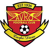
The distinctive triangular logo which we now see incorporated into the emblem of Avro FC pre-dates the formation of the Avro company and has its origins on the front of a shed at Brooklands, Surrey where AV did much of his pioneering work.
At that point it was a plain black triangle but soon “grew wings” so to speak, possibly to represent the success of the operation but, more likely, to immediately identify what the company was all about.
Moving the story forward somewhat, the company became very successful manufacturing aircraft both during and after the First World War. A.V. Roe purchased a small factory in Failsworth on land which contained Failsworth Lodge.
The lodge was bought by Roy Dobson who was Avro’s Works Manager in 1936 and the football club was established as a works team – one of many such teams associated with industrial facilities at the time.
Shortly afterwards, the bigger factory at nearby Chadderton was opened, paving the way to the production of many of the iconic aircraft of the Second World War and beyond.
The significant date of 1936 is recorded on the emblem of Avro FC along with a football and, for the first time for quite some time in this series of articles, a motto in Latin and a quite familiar one at that. Carpe Diem translates readily as Seize the Day.
However, that’s not the full story of the motto. Carpe Diem is a shortened version of carpe diem quam minimum credula postero and I could readily leave it to the Latin scholars, of which, no doubt, there are many amongst my loyal readership to translate the whole quotation.
But, for those of us who failed Latin O-Level, that is myself, we can come up with “seize the day trusting as little as possible in the future”.
Given that the quotation is credited to the Roman poet Horace who was around in the first century BC, we have to give this one 10 out for 10 for forward thinking, in that another translation or interpretation which comes readily to mind is live for the day or, slightly more prosaically, tomorrow never comes.
Quite something, these classical scholars of over 2000 years ago, and much of what we take as read today can be found in their work.
Anyway, enough of the philosophising and back to the emblem. What we have yet to consider in detail is both the triangular design and the colours.
If we look first of all at the colours, then the history of the company suggests that this was something of a moveable feast, in that basic designs of the company logo have appeared in lots of different colours down the years, reds and yellows being used in the 1950s. So, perhaps, we mustn’t try to read too much into the use of red and yellow here.
The triangular shape is described above as being a representation of the sign above the hangar door at Brooklands, but there is another explanation which does rather appeal.
It is said that when AV, somewhat into his dotage but still as sharp as the sharpest pin, was asked about this triangular design it was recorded that he was influenced by his fondness of the triangular Cape of Good Hope postage stamps. And why not?
With thanks to Mark Hutton of Avro FC for his contribution to this article.
Emblematically Speaking - Avro
Tue 11th December 2018 | Avro
By Stewart Taylor
This week we look into an emblem selected by a works football team and, with that, a short look at one of the most iconic of all British engineering companies.
Go back, if you will, to the very origins of powered flight and this is the story of a man from the outskirts of Manchester who epitomised all that was good about design and engineering.
Edwin Alliott Verdun Roe was the first Englishman to fly an all British aircraft. In 1909 he designed and flew his Avroplane which is preserved in the Science Museum in London.
Not content with being an inventor and pioneer, AV as he became to be known, set up his own factory, along with his brother Humphrey, in the name of AV Roe in 1910 on Great Ancoats Street in Manchester. The company swiftly became known as Avro.
The distinctive triangular logo which we now see incorporated into the emblem of Avro FC pre-dates the formation of the Avro company and has its origins on the front of a shed at Brooklands, Surrey where AV did much of his pioneering work.
At that point it was a plain black triangle but soon “grew wings” so to speak, possibly to represent the success of the operation but, more likely, to immediately identify what the company was all about.
Moving the story forward somewhat, the company became very successful manufacturing aircraft both during and after the First World War. A.V. Roe purchased a small factory in Failsworth on land which contained Failsworth Lodge.
The lodge was bought by Roy Dobson who was Avro’s Works Manager in 1936 and the football club was established as a works team – one of many such teams associated with industrial facilities at the time.
Shortly afterwards, the bigger factory at nearby Chadderton was opened, paving the way to the production of many of the iconic aircraft of the Second World War and beyond.
The significant date of 1936 is recorded on the emblem of Avro FC along with a football and, for the first time for quite some time in this series of articles, a motto in Latin and a quite familiar one at that. Carpe Diem translates readily as Seize the Day.
However, that’s not the full story of the motto. Carpe Diem is a shortened version of carpe diem quam minimum credula postero and I could readily leave it to the Latin scholars, of which, no doubt, there are many amongst my loyal readership to translate the whole quotation.
But, for those of us who failed Latin O-Level, that is myself, we can come up with “seize the day trusting as little as possible in the future”.
Given that the quotation is credited to the Roman poet Horace who was around in the first century BC, we have to give this one 10 out for 10 for forward thinking, in that another translation or interpretation which comes readily to mind is live for the day or, slightly more prosaically, tomorrow never comes.
Quite something, these classical scholars of over 2000 years ago, and much of what we take as read today can be found in their work.
Anyway, enough of the philosophising and back to the emblem. What we have yet to consider in detail is both the triangular design and the colours.
If we look first of all at the colours, then the history of the company suggests that this was something of a moveable feast, in that basic designs of the company logo have appeared in lots of different colours down the years, reds and yellows being used in the 1950s. So, perhaps, we mustn’t try to read too much into the use of red and yellow here.
The triangular shape is described above as being a representation of the sign above the hangar door at Brooklands, but there is another explanation which does rather appeal.
It is said that when AV, somewhat into his dotage but still as sharp as the sharpest pin, was asked about this triangular design it was recorded that he was influenced by his fondness of the triangular Cape of Good Hope postage stamps. And why not?
With thanks to Mark Hutton of Avro FC for his contribution to this article.