Emblematically Speaking - Winsford United
Tue 19th September 2017 | Winsford United | By Stewart Taylor
This week we look at another club emblem which is a reflection of change but respecting tradition.
One of our longest established clubs is Winsford United and, quite rightly, they are very proud of the achievement of being around for well over 100 years.
For many of those years the football club adopted the Winsford Town Council coat of arms. As befits a town coat of arms, the devices were chosen to symbolise important elements in the identity of the town.
These included, the wheatsheaves of Cheshire, the lions of England and salt baskets dripping in brine.
It is this latter device which focuses in more precisely on what people might think of, when the town of Winsford comes up in conversation, and it is this element which takes us forward to the current emblem.
Winsford United Secretary Bob Astles takes up the story.
“Eight years ago it was decided to change to a badge that was specific to the football club as the town badge didn’t really reflect our position as a football club. We also wanted it to display the club’s traditional colours.
“We approached Brian Spink, son of Bob Spink, one of our stalwart supporters, and experienced in graphic design, to create a new badge. We decided on the badge that we now use.
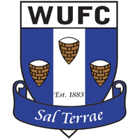
“The three symbols on the badge reflect the town’s main claim to fame which is the salt industry. They show images of the baskets that were used to collect salt that was distilled from huge vats of brine that had been filled by sending water into the rock salt and pumping it to the surface where the water was boiled away to leave the salt”.
“We needed a motto and I came up with Sal Terrae which translates from Latin as “Salt of the Earth” which reflects the town’s historic industry and also it’s standing as a working class town.
”I had to check with a friend of mine who is a retired Latin teacher to make sure the grammar was correct”.
Armed with our newly acquired knowledge of heraldry, we can see that this new emblem does exactly what it was intended to do, but does it in a way that chimes with standard heraldic design.
I could at this stage set something of a challenge and ask the reader to come up with a form of heraldic wording which describes this new emblem. I could but, being a kind and considerate person, perhaps it’s a bit early in our exploration of all things heraldic to do that. Although, I may come back to the idea later in the series!
Instead, I’ll give it a go.
Azure a pale argent, three salt baskets on chief argent. Motto Sal Terrae in banderole azure.
There we go, not too tricky is it!
(Our thanks to Bob Astles of Winsford United for his help in compiling this article – in fact, Bob wrote most of it.)
 Emblematically Speaking - Winsford United
Tue 19th September 2017 | Winsford United
By Stewart Taylor

This week we look at another club emblem which is a reflection of change but respecting tradition.
One of our longest established clubs is Winsford United and, quite rightly, they are very proud of the achievement of being around for well over 100 years.
For many of those years the football club adopted the Winsford Town Council coat of arms. As befits a town coat of arms, the devices were chosen to symbolise important elements in the identity of the town.
These included, the wheatsheaves of Cheshire, the lions of England and salt baskets dripping in brine.
It is this latter device which focuses in more precisely on what people might think of, when the town of Winsford comes up in conversation, and it is this element which takes us forward to the current emblem.
Winsford United Secretary Bob Astles takes up the story.
“Eight years ago it was decided to change to a badge that was specific to the football club as the town badge didn’t really reflect our position as a football club. We also wanted it to display the club’s traditional colours.
“We approached Brian Spink, son of Bob Spink, one of our stalwart supporters, and experienced in graphic design, to create a new badge. We decided on the badge that we now use.
“The three symbols on the badge reflect the town’s main claim to fame which is the salt industry. They show images of the baskets that were used to collect salt that was distilled from huge vats of brine that had been filled by sending water into the rock salt and pumping it to the surface where the water was boiled away to leave the salt”.
“We needed a motto and I came up with Sal Terrae which translates from Latin as “Salt of the Earth” which reflects the town’s historic industry and also it’s standing as a working class town.
”I had to check with a friend of mine who is a retired Latin teacher to make sure the grammar was correct”.
Armed with our newly acquired knowledge of heraldry, we can see that this new emblem does exactly what it was intended to do, but does it in a way that chimes with standard heraldic design.
I could at this stage set something of a challenge and ask the reader to come up with a form of heraldic wording which describes this new emblem. I could but, being a kind and considerate person, perhaps it’s a bit early in our exploration of all things heraldic to do that. Although, I may come back to the idea later in the series!
Instead, I’ll give it a go.
Azure a pale argent, three salt baskets on chief argent. Motto Sal Terrae in banderole azure.
There we go, not too tricky is it!
(Our thanks to Bob Astles of Winsford United for his help in compiling this article – in fact, Bob wrote most of it.)

