Emblematically Speaking - Abbey Hulton United
Tue 10th October 2017 | Abbey Hulton United | By Stewart Taylor
This week, we have a look at a club emblem which brings together elements of traditional heraldry and some more modern features.
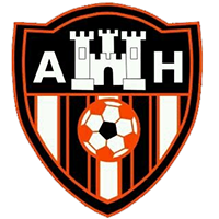
The traditional part is the shield which shows the top third in black (sable in heraldic colours) with the lower two thirds showing vertical stripes.
The shield is slightly unusual in design, in that it is not horizontal across the top.
Many would suggest that devices depicted on traditional shields are too small to be readily discernable.
Therefore, it is tempting to think that this design has been done in such a way as to make the main device of the shield of a size which rests more easily on the eye. There is no evidence for this but it is quite a compelling argument.
This main device is a representation of an abbey and, specifically, Hulton Abbey.
The village of Abbey Hulton takes its name from the former Hulton Abbey, which was located about half a mile from Milton, on the east side of the road from Stoke-on-Trent to Leek, close to the ground. The village now forms part of the suburbs of the city of Stoke-on-Trent.
As we muse on the emblems which our clubs use as identifiers we will see some common elements. We have already come across Cistercian monks in the context of Kirkstall Priory in Yorkshire and the link to Barnoldswick.
Here we see that Hulton Abbey, dedicated to St Mary as is Ghyll Church in Barnoldswick, also belonged to the Cistercian order, having been established in 1223 by Henry de Audley.
The Audley family is just one of many somewhat dynastic families which crop up regularly in the history of England. The success, or otherwise, of these families largely depended on who’s flag you nailed your colours to as the period from the Norman Conquest until relatively recently was dominated by grace and favour – some may say it still is!
The Audley family did OK by aligning themselves with the powerful Earls of Chester in the 13th century and did fine until the dynasty rather came to an end sometime in the 14th century as a marriage produced a daughter and, on her marriage, the family name was lost.
This could perhaps be described as Audley’s End, but any reference to a Jacobean mansion house of that name near Saffron Waldon in Essex is likely to be purely coincidental.
Hulton Abbey was surrendered to the Crown on 18th September 1538 by which time it was worth only £200 per year and had only nine monks including the abbot. It was always one of the poorest of Staffordshire’s monasteries. The ruins are in the process of being restored.
The capital A and H either side of the depiction of the Abbey on the shield are self-explanatory.
And now a bit more on heraldic design. Stripes appear quite regularly on heraldic shields. They can, of course, be either horizontal, vertical or even diagonal and, as with much of heraldry, these have their own names.
In this case we see vertical stripes, a pattern of which are known as a paly. What we also see in the centre of the shield is a football which, of course, makes reference to the emblem representing a football club. The visual centre of the shield is known as the fess point. Gradually, as we go through this series, we will build up the vocabulary of heraldry.
There is no requirement to have an understanding of Latin to discern exactly which organisation the emblem represents, as by the time of the formation of Abbey Hulton United in 1947, the use of Latin was considered to be somewhat dated. Having said that, I did do Latin up to O-Level back in the day and, no, I don’t pre-date 1947 – well, not quite.
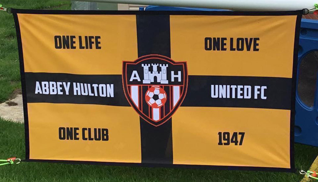
The colours of the emblem, orange and black, are derived from the playing colours of the club.
Our thanks to John Wightman of Abbey Hulton United for his help in putting together this article.
Emblematically Speaking - Abbey Hulton United
Tue 10th October 2017 | Abbey Hulton United
By Stewart Taylor
This week, we have a look at a club emblem which brings together elements of traditional heraldry and some more modern features.
The traditional part is the shield which shows the top third in black (sable in heraldic colours) with the lower two thirds showing vertical stripes.
The shield is slightly unusual in design, in that it is not horizontal across the top.
Many would suggest that devices depicted on traditional shields are too small to be readily discernable.
Therefore, it is tempting to think that this design has been done in such a way as to make the main device of the shield of a size which rests more easily on the eye. There is no evidence for this but it is quite a compelling argument.
This main device is a representation of an abbey and, specifically, Hulton Abbey.
The village of Abbey Hulton takes its name from the former Hulton Abbey, which was located about half a mile from Milton, on the east side of the road from Stoke-on-Trent to Leek, close to the ground. The village now forms part of the suburbs of the city of Stoke-on-Trent.
As we muse on the emblems which our clubs use as identifiers we will see some common elements. We have already come across Cistercian monks in the context of Kirkstall Priory in Yorkshire and the link to Barnoldswick.
Here we see that Hulton Abbey, dedicated to St Mary as is Ghyll Church in Barnoldswick, also belonged to the Cistercian order, having been established in 1223 by Henry de Audley.
The Audley family is just one of many somewhat dynastic families which crop up regularly in the history of England. The success, or otherwise, of these families largely depended on who’s flag you nailed your colours to as the period from the Norman Conquest until relatively recently was dominated by grace and favour – some may say it still is!
The Audley family did OK by aligning themselves with the powerful Earls of Chester in the 13th century and did fine until the dynasty rather came to an end sometime in the 14th century as a marriage produced a daughter and, on her marriage, the family name was lost.
This could perhaps be described as Audley’s End, but any reference to a Jacobean mansion house of that name near Saffron Waldon in Essex is likely to be purely coincidental.
Hulton Abbey was surrendered to the Crown on 18th September 1538 by which time it was worth only £200 per year and had only nine monks including the abbot. It was always one of the poorest of Staffordshire’s monasteries. The ruins are in the process of being restored.
The capital A and H either side of the depiction of the Abbey on the shield are self-explanatory.
And now a bit more on heraldic design. Stripes appear quite regularly on heraldic shields. They can, of course, be either horizontal, vertical or even diagonal and, as with much of heraldry, these have their own names.
In this case we see vertical stripes, a pattern of which are known as a paly. What we also see in the centre of the shield is a football which, of course, makes reference to the emblem representing a football club. The visual centre of the shield is known as the fess point. Gradually, as we go through this series, we will build up the vocabulary of heraldry.
There is no requirement to have an understanding of Latin to discern exactly which organisation the emblem represents, as by the time of the formation of Abbey Hulton United in 1947, the use of Latin was considered to be somewhat dated. Having said that, I did do Latin up to O-Level back in the day and, no, I don’t pre-date 1947 – well, not quite.
The colours of the emblem, orange and black, are derived from the playing colours of the club.
Our thanks to John Wightman of Abbey Hulton United for his help in putting together this article.