Emblematically Speaking - 1874 Northwich
Tue 1st August 2017 | 1874 Northwich | By Stewart Taylor
We start the series with one of our most recently formed clubs and an emblem which is, effectively, making its debut this season.
Many within the Hallmark Security League will have an awareness of why 1874 Northwich was born back in 2012.
Defined and organised as a supporter owned club from the very outset, it comes as no surprise to discover that supporters have been heavily involved in all aspects of club branding from the very beginning, and that includes the club emblem.
The club’s first emblem reflected where the club had come from, and included a number of references to traditional heraldic design such as a Phoenix facing forward to the future, the three gold wheatsheaves representing the Earldom of Chester and blue bands in each of the phoenix’s claws representing the rivers Dane and Weaver which join in the centre of Northwich.
The club felt that this was the right design to kick start their future, but as time went by they realised that they needed to do more to differentiate themselves from the former club.
A significant element to what was going to be a rebranding was the creation of a visual identity which would appeal to younger supporters. As is appropriate for a fan owned club, two of the club members stepped forward to work on designs.
The outcome of a process, which included approval by the football club board, test marketing amongst the volunteers at the club, the use of the new design on social media campaigns and via merchandising, was a full approval by the club membership to adopt the new emblem design from July 1st 2017.
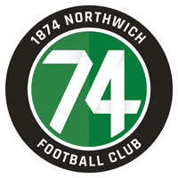
The new design, depicted here, is, by contrast with many football club emblems, both elegant and modern.
We could readily consider that the circular design brings to mind football, and along with the number 74 which dominates the centre of the roundel, identifies the club and its purpose very readily.
The modern styling of the numerals chimes with the objectives of the design, and cross-references nicely with the club rallying call “We are 74”.
Closer inspection of the writing around the perimeter of the roundel, done in a very clear white on black format, confirms what a quick glance would indicate.
Colour choices are always of interest and informative. What we see here is the use of the playing colours of the club and that is another powerful message in terms of club identity which is portrayed via the emblem.
The club are rightly proud of the progress made to date and include the emblem design in the hope that the club will move forward to a bright future whilst ensuring that they don’t dwell on the past.
(Our thanks to Vicki England at 1874 Northwich for her assistance with this article)
Emblematically Speaking - 1874 Northwich
Tue 1st August 2017 | 1874 Northwich
By Stewart Taylor
We start the series with one of our most recently formed clubs and an emblem which is, effectively, making its debut this season.
Many within the Hallmark Security League will have an awareness of why 1874 Northwich was born back in 2012.
Defined and organised as a supporter owned club from the very outset, it comes as no surprise to discover that supporters have been heavily involved in all aspects of club branding from the very beginning, and that includes the club emblem.
The club’s first emblem reflected where the club had come from, and included a number of references to traditional heraldic design such as a Phoenix facing forward to the future, the three gold wheatsheaves representing the Earldom of Chester and blue bands in each of the phoenix’s claws representing the rivers Dane and Weaver which join in the centre of Northwich.
The club felt that this was the right design to kick start their future, but as time went by they realised that they needed to do more to differentiate themselves from the former club.
A significant element to what was going to be a rebranding was the creation of a visual identity which would appeal to younger supporters. As is appropriate for a fan owned club, two of the club members stepped forward to work on designs.
The outcome of a process, which included approval by the football club board, test marketing amongst the volunteers at the club, the use of the new design on social media campaigns and via merchandising, was a full approval by the club membership to adopt the new emblem design from July 1st 2017.
The new design, depicted here, is, by contrast with many football club emblems, both elegant and modern.
We could readily consider that the circular design brings to mind football, and along with the number 74 which dominates the centre of the roundel, identifies the club and its purpose very readily.
The modern styling of the numerals chimes with the objectives of the design, and cross-references nicely with the club rallying call “We are 74”.
Closer inspection of the writing around the perimeter of the roundel, done in a very clear white on black format, confirms what a quick glance would indicate.
Colour choices are always of interest and informative. What we see here is the use of the playing colours of the club and that is another powerful message in terms of club identity which is portrayed via the emblem.
The club are rightly proud of the progress made to date and include the emblem design in the hope that the club will move forward to a bright future whilst ensuring that they don’t dwell on the past.
(Our thanks to Vicki England at 1874 Northwich for her assistance with this article)