Emblematically Speaking - Litherland REMYCA
Tue 20th March 2018 | Litherland REMYCA | By Stewart Taylor
Students of unusual football club names will be intrigued by the name of this club – think Crewe Alexandra, Plymouth Argyle and the splendidly named Sporting Khalsa from the Premier Division of the Midland League.
There are some even more intriguing club names from the world of Sunday football, but space prevents a diversion down this particular path, although there is a rich seam to mine for interested parties.
As many across the region and beyond may know, what we now know as Litherland REMYCA FC started life as St Thomas FC in 1959, later becoming known as Bootle Church Lads Brigade.
Through a number of associations over the next 10 years or so the club came to be known as Remyca United reflecting the financial contribution to the club of the REM Social Club and the provision of playing facilities by Bootle YMCA.
As the club is strongly linked to Litherland in the Borough of Sefton, the club added the ‘Litherland’ prefix to the Remyca name to encourage the area to positively identify with the club as it evolved.
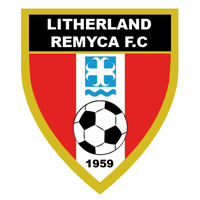
The emblem of the club was designed in 2013 when the decision was taken to develop the club as a community club. The colours of the emblem were chosen to reflect the playing colours of red, white and black.
The year of foundation of the original club, founded by Billy and Kenny Edwards in 1959, was an appropriate addition to a shield design which also incorporates a representation of a football to clearly identify the purpose of the organisation.
The remaining device on the shield will be familiar to local residents as the logo of the Metropolitan District of Sefton. Regular readers of these articles will already be familiar with the Local Government Act of 1972 and it was the implementation of this piece of legislation in 1974 which effectively brought about Sefton as one of the five Metropolitan Districts of the Metropolitan County of Merseyside.
The constituent parts of Sefton are the former County Boroughs of Bootle and Southport, the Municipal Borough of Crosby, the Urban Districts of Formby and Litherland along with part of the West Lancashire Rural District.
The cross, in white on a pale blue background, is of the style known generally as moline. Specifically, a moline cross refers to a representation of a millrind – see the article relating to Atherton LR FC for additional information - but there are a number of established variations. One such is known a croix ancree in French which translates into English as anchor cross.
As a millrind relates specifically to the milling industry it seems more than reasonable that the form of the cross on the logo of Sefton Council is an anchor cross, representing the geography of the area.
We may think that when the logo of Sefton was being designed, reference may have been made to the constituent parts of the District. Whilst there is a cross in the Coat of Arms of the Borough of Crosby it is of a different design. Specifically, it is a cross pattee and is distinct from an anchor cross.
This point is somewhat reinforced by the choice of the pale blue colour and the presence of another old friend of a device in the form of a wavy line. It is perhaps not entirely clear if this wavy line represents the River Mersey as we have seen in a number of previous articles or is a reflection of the largely coastal nature of Sefton Borough.
We would, on balance, suggest the latter but, as ever, if anyone knows definitively then please get in touch.
The incorporation of the logo of the local council into a football club emblem places the club firmly geographically and shows pride in the region in which the club was born, lives and thrives.
Our thanks to Gary Langley for his contribution to this article.
Emblematically Speaking - Litherland REMYCA
Tue 20th March 2018 | Litherland REMYCA
By Stewart Taylor
Students of unusual football club names will be intrigued by the name of this club – think Crewe Alexandra, Plymouth Argyle and the splendidly named Sporting Khalsa from the Premier Division of the Midland League.
There are some even more intriguing club names from the world of Sunday football, but space prevents a diversion down this particular path, although there is a rich seam to mine for interested parties.
As many across the region and beyond may know, what we now know as Litherland REMYCA FC started life as St Thomas FC in 1959, later becoming known as Bootle Church Lads Brigade.
Through a number of associations over the next 10 years or so the club came to be known as Remyca United reflecting the financial contribution to the club of the REM Social Club and the provision of playing facilities by Bootle YMCA.
As the club is strongly linked to Litherland in the Borough of Sefton, the club added the ‘Litherland’ prefix to the Remyca name to encourage the area to positively identify with the club as it evolved.
The emblem of the club was designed in 2013 when the decision was taken to develop the club as a community club. The colours of the emblem were chosen to reflect the playing colours of red, white and black.
The year of foundation of the original club, founded by Billy and Kenny Edwards in 1959, was an appropriate addition to a shield design which also incorporates a representation of a football to clearly identify the purpose of the organisation.
The remaining device on the shield will be familiar to local residents as the logo of the Metropolitan District of Sefton. Regular readers of these articles will already be familiar with the Local Government Act of 1972 and it was the implementation of this piece of legislation in 1974 which effectively brought about Sefton as one of the five Metropolitan Districts of the Metropolitan County of Merseyside.
The constituent parts of Sefton are the former County Boroughs of Bootle and Southport, the Municipal Borough of Crosby, the Urban Districts of Formby and Litherland along with part of the West Lancashire Rural District.
The cross, in white on a pale blue background, is of the style known generally as moline. Specifically, a moline cross refers to a representation of a millrind – see the article relating to Atherton LR FC for additional information - but there are a number of established variations. One such is known a croix ancree in French which translates into English as anchor cross.
As a millrind relates specifically to the milling industry it seems more than reasonable that the form of the cross on the logo of Sefton Council is an anchor cross, representing the geography of the area.
We may think that when the logo of Sefton was being designed, reference may have been made to the constituent parts of the District. Whilst there is a cross in the Coat of Arms of the Borough of Crosby it is of a different design. Specifically, it is a cross pattee and is distinct from an anchor cross.
This point is somewhat reinforced by the choice of the pale blue colour and the presence of another old friend of a device in the form of a wavy line. It is perhaps not entirely clear if this wavy line represents the River Mersey as we have seen in a number of previous articles or is a reflection of the largely coastal nature of Sefton Borough.
We would, on balance, suggest the latter but, as ever, if anyone knows definitively then please get in touch.
The incorporation of the logo of the local council into a football club emblem places the club firmly geographically and shows pride in the region in which the club was born, lives and thrives.
Our thanks to Gary Langley for his contribution to this article.