Emblematically Speaking - Sandbach United
Tue 28th November 2017 | Sandbach United | By Stewart Taylor
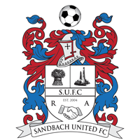
The Sandbach United emblem is based on the Coat of Arms of Sandbach and includes a now familiar wheatsheaf, representing Cheshire, on the shield.
The other major element on the shield is a pair of Saxon crosses and it is of interest to consider these in more detail, as they are one of the major attractions of the town.
The first documentary reference to the Sandbach Crosses is by William Smith, a Herald, in 1585 when he describes them as being present in the market place.
It is assumed that they were broken up by Puritan iconoclasts – great word that - in the seventeenth century, with fragments scattered over a wide area. The larger sections were found as far away as Oulton and Tarporley, whilst smaller pieces were found on various sites in Sandbach.
They were eventually re-erected on their original site in 1816 under the direction of Dr. George Ormerod, the Cheshire historian.
Theories abound to explain how and why they were created, with some being more credible than others. Dr. Jane Hawkes book “The Sandbach Crosses” was written with the support of English Heritage and is considered the greatest authority on Sandbach’s Saxon Crosses.
Dr. Hawkes has studied the iconography of the carvings in great detail and has concluded the larger cross was carved in the first half of the ninth century and the smaller cross was completed slightly later, in the middle of the ninth century.
The decoration on both structures suggests the presence of an ecclesiastical centre in the Sandbach region, that expressed its authority through the production of large-scale stone monuments proclaiming the Christian message. The Crosses would originally have been brightly painted and decorated with jewels and metal inserts.
The football in the crest is self explanatory and replaces a red half wheel, representing automotive and heavy industries, in the town Coat of Arms. The remainder of the customisation goes a long way to explain the history of the club.
Sandbach United Football Club was established in 2004 when Sandbach Albion and Sandbach Ramblers joined forces in their quest to improve the football facilities in Sandbach. This is the origin of the letters R & A and the hand-shaking graphic on the club emblem.
The motto on the town Coat of Arms is 'Principia Non Homines' (Latin) and represents a bit of a challenge in translation. The recognised translation is “principles not men” but this seems in some ways to be less than satisfactory.
If the motto is written slightly differently it could become ‘Principia et Homines’ which would translate to “facts not principles”, which could again be considered to be slightly odd in modern day usage.
Anyway, Sandbach United decided to dispense altogether with the Latin motto, replacing it simply with the name of the club – very wise move.
What we have as a whole is another example of a football club emblem which respects the traditions of the town it represents, yet clearly reflects that the emblem refers to a football club.
Our thanks to John Clayton of Sandbach United for his help in compiling this article.
Emblematically Speaking - Sandbach United
Tue 28th November 2017 | Sandbach United
By Stewart Taylor
The Sandbach United emblem is based on the Coat of Arms of Sandbach and includes a now familiar wheatsheaf, representing Cheshire, on the shield.
The other major element on the shield is a pair of Saxon crosses and it is of interest to consider these in more detail, as they are one of the major attractions of the town.
The first documentary reference to the Sandbach Crosses is by William Smith, a Herald, in 1585 when he describes them as being present in the market place.
It is assumed that they were broken up by Puritan iconoclasts – great word that - in the seventeenth century, with fragments scattered over a wide area. The larger sections were found as far away as Oulton and Tarporley, whilst smaller pieces were found on various sites in Sandbach.
They were eventually re-erected on their original site in 1816 under the direction of Dr. George Ormerod, the Cheshire historian.
Theories abound to explain how and why they were created, with some being more credible than others. Dr. Jane Hawkes book “The Sandbach Crosses” was written with the support of English Heritage and is considered the greatest authority on Sandbach’s Saxon Crosses.
Dr. Hawkes has studied the iconography of the carvings in great detail and has concluded the larger cross was carved in the first half of the ninth century and the smaller cross was completed slightly later, in the middle of the ninth century.
The decoration on both structures suggests the presence of an ecclesiastical centre in the Sandbach region, that expressed its authority through the production of large-scale stone monuments proclaiming the Christian message. The Crosses would originally have been brightly painted and decorated with jewels and metal inserts.
The football in the crest is self explanatory and replaces a red half wheel, representing automotive and heavy industries, in the town Coat of Arms. The remainder of the customisation goes a long way to explain the history of the club.
Sandbach United Football Club was established in 2004 when Sandbach Albion and Sandbach Ramblers joined forces in their quest to improve the football facilities in Sandbach. This is the origin of the letters R & A and the hand-shaking graphic on the club emblem.
The motto on the town Coat of Arms is 'Principia Non Homines' (Latin) and represents a bit of a challenge in translation. The recognised translation is “principles not men” but this seems in some ways to be less than satisfactory.
If the motto is written slightly differently it could become ‘Principia et Homines’ which would translate to “facts not principles”, which could again be considered to be slightly odd in modern day usage.
Anyway, Sandbach United decided to dispense altogether with the Latin motto, replacing it simply with the name of the club – very wise move.
What we have as a whole is another example of a football club emblem which respects the traditions of the town it represents, yet clearly reflects that the emblem refers to a football club.
Our thanks to John Clayton of Sandbach United for his help in compiling this article.