Emblematically Speaking - AFC Blackpool
Tue 14th November 2017 | AFC Blackpool | By Stewart Taylor
It is suspected that only a small number of individuals know the history behind this club emblem and, unfortunately, we don’t know how to contact them. Sounds a bit strange? Well, read on and all, or not very much, will be revealed.
As many followers of the NWCFL will know, AFC Blackpool are, in effect, the old Blackpool Mechanics FC who were previously known as Blackpool Metal Mechanics FC.
A descriptive name if ever there was one and the original club emblem was a reflection of that featuring, as it did, a cross spanners device, in addition to a couple of red Lancashire roses and a seagull, on a conventional shield design.
The Mechanics were renamed AFC Blackpool in 2008 and, as is reasonable under such circumstances, introduced a new club emblem.
This emblem was designed by someone who was involved with the club at the time, but has since left.
AFC Blackpool have a number of individuals who were involved with the club when it was Blackpool Mechanics, but those still around today know nothing about the origins and design of the current emblem, as they were not party to the discussions at the time.
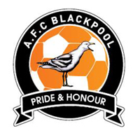
So we have what we see, and ask the question “What can we make of it?”
The use of a roundel is indicative of an emblem design which is relatively recent. It is easy to imagine that the use of a roundel in itself is an indication that the business of the organisation is a football club but that would not really be the case as emblems of this basic outline appear as representations of many different types of enterprises.
The real reference to the emblem representing a football club comes in the orange and white background representation of a football and, of course, the name of the club.
The major device is a seagull and such a bird is most certainly emblematic of the town of Blackpool.
We have seen above how a seagull was represented in the emblem of Blackpool Mechanics FC and it also appears on the rather elaborate emblem of the local professional football club, Blackpool FC.
That the seagull is depicted “open mouthed” suggests that it is making that squawking, chirping and wailing sound characteristic of this sometimes aggressive bird.
Alternatively, we may suggest that it is open mouthed mode in anticipation of robbing some unsuspecting tourist, sat on the promenade calmly minding their own business, of either ice cream or chips.
The colours of orange, white and black reproduce the colours of the emblem of Blackpool Mechanics FC and represent the playing colours of the club.
This leaves us with the motto. What we have done previously in this series of articles is to translate mottos in Latin into English.
This time we have done it the other way and taken the motto ‘Pride and Honour’ and translated that into Latin which comes out as ‘Superbia et Honore’. We can then look to see if there is any link between this Latin motto and AFC Blackpool.
Despite extensive searches we can find no tangible link. Indeed, the motto of Blackpool Town Council is simply ‘Progress’ and this is repeated on the emblem of Blackpool FC.
The nearest we can find is ‘Superbia in Proelio’ which is the motto of Manchester City FC and means ‘Pride in Battle’.
Maybe one of those involved at the club back in 2008/09 was a Manchester City supporter but, like a number of aspects to this story, we will probably never know.
Emblematically Speaking - AFC Blackpool
Tue 14th November 2017 | AFC Blackpool
By Stewart Taylor
It is suspected that only a small number of individuals know the history behind this club emblem and, unfortunately, we don’t know how to contact them. Sounds a bit strange? Well, read on and all, or not very much, will be revealed.
As many followers of the NWCFL will know, AFC Blackpool are, in effect, the old Blackpool Mechanics FC who were previously known as Blackpool Metal Mechanics FC.
A descriptive name if ever there was one and the original club emblem was a reflection of that featuring, as it did, a cross spanners device, in addition to a couple of red Lancashire roses and a seagull, on a conventional shield design.
The Mechanics were renamed AFC Blackpool in 2008 and, as is reasonable under such circumstances, introduced a new club emblem.
This emblem was designed by someone who was involved with the club at the time, but has since left.
AFC Blackpool have a number of individuals who were involved with the club when it was Blackpool Mechanics, but those still around today know nothing about the origins and design of the current emblem, as they were not party to the discussions at the time.
So we have what we see, and ask the question “What can we make of it?”
The use of a roundel is indicative of an emblem design which is relatively recent. It is easy to imagine that the use of a roundel in itself is an indication that the business of the organisation is a football club but that would not really be the case as emblems of this basic outline appear as representations of many different types of enterprises.
The real reference to the emblem representing a football club comes in the orange and white background representation of a football and, of course, the name of the club.
The major device is a seagull and such a bird is most certainly emblematic of the town of Blackpool.
We have seen above how a seagull was represented in the emblem of Blackpool Mechanics FC and it also appears on the rather elaborate emblem of the local professional football club, Blackpool FC.
That the seagull is depicted “open mouthed” suggests that it is making that squawking, chirping and wailing sound characteristic of this sometimes aggressive bird.
Alternatively, we may suggest that it is open mouthed mode in anticipation of robbing some unsuspecting tourist, sat on the promenade calmly minding their own business, of either ice cream or chips.
The colours of orange, white and black reproduce the colours of the emblem of Blackpool Mechanics FC and represent the playing colours of the club.
This leaves us with the motto. What we have done previously in this series of articles is to translate mottos in Latin into English.
This time we have done it the other way and taken the motto ‘Pride and Honour’ and translated that into Latin which comes out as ‘Superbia et Honore’. We can then look to see if there is any link between this Latin motto and AFC Blackpool.
Despite extensive searches we can find no tangible link. Indeed, the motto of Blackpool Town Council is simply ‘Progress’ and this is repeated on the emblem of Blackpool FC.
The nearest we can find is ‘Superbia in Proelio’ which is the motto of Manchester City FC and means ‘Pride in Battle’.
Maybe one of those involved at the club back in 2008/09 was a Manchester City supporter but, like a number of aspects to this story, we will probably never know.